Color circle Combination of colors in clothing. Color circle and color combinations. Gray with green
Color surrounds us every day and every minute. Subconsciously, we react differently to different colors. With the help of the color circle, we can learn to competently combine different shades in your wardrobe, make the right color accents and always look excellent.
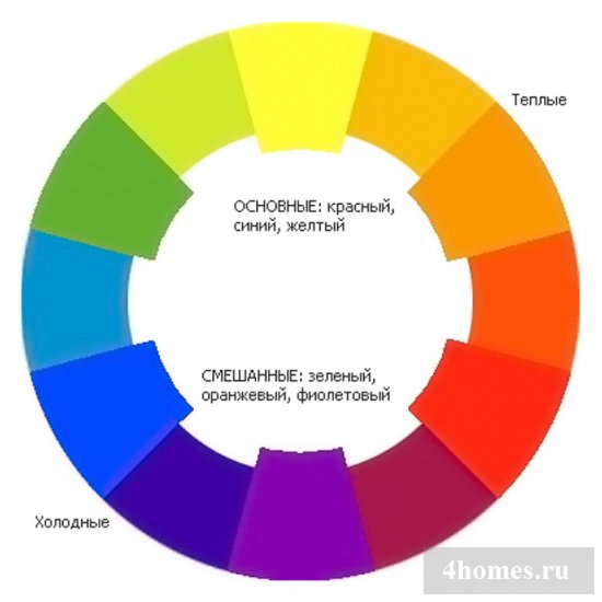
Consists of 12 colors. There are 3 main or primary colors - it is red, yellow and blue. These colors cannot be obtained by mixing with others. Secondary colors are obtained by mixing primary colors: red and yellow give orange, yellow and blue - green, and blue and red - purple. The remaining 6 colors on the color circle are obtained by mixing primary and secondary colors - yellow-orange, yellow-green, blue-green, blue-purple, red-purple, red-orange.

Black and white in the color circle are not included, because they do not contain colors. But their addition to the colors give us a variety of shades that we use in life. Often in the color circle there is gradation of colors - the radius of crushed colors (with the addition of white), the radius of muffled colors (with the addition of gray) and the radius of the shredded colors (with the addition of black).
With the help of a circle, we can define harmonious color combinations. The first combination is complimentary - a combination of two opposite colors. Such a combination gives a very high contrast, the colors complement and strengthen each other. Green and red, purple and yellow - on a circle you can find 6 combinations.

The split (separate) complimentary combination or related-contrasting colors is a scheme where one of the opposite colors is replaced by two rooms located next to the circle. This combination gives interesting variations. For example, green, red-purple and red-orange; Purple, yellow and yellow-orange and so on.

The third combination is a triad. This is a combination of three equidistant (located on the top of the triangle) in the flower circle of colors. The primary scheme is a combination of primary colors - blue, yellow and red. The secondary scheme is a combination of orange, green and purple. Tertiary scheme - a combination of tertiary colors, it is red-purple,
Blue-green and yellow-orange, the second triad is red-orange, blue-purple and yellow-green.

Very pleasant and harmonious combination - monochrome. This combination of shades of one color always looks very exquisite and noble. For example, green, herbal, emerald, mint.

The following combination is related or similar colors - 2 or 3 near the sectors located in the color circle. Look in one image very harmonious, calm and
There is no bright contrast between colors. Example, blue, blue and green and blue-purple.

Another color combination is the use of colors of one brightness level. For example, you can use any shades that are on one radius in the color circle. For example, pink, blue, mint, lilac.

Also in the color circle there is another combination - a rectangular scheme or tetrad. This is a very complicated combination in which you need to be extremely careful and to comply with the balance of the main and additional colors. In this scheme, 2 pairs are used - the opposite color and the appropriate analog. For example, green, orange, blue and red.

These are only the main combinations that can be found using the color circle. Also in the circle you can enter a square or hexagon, but using such a variety and contrast you need to feel good and observe the balance without turning your image into the rainbow.

The task of choosing a color scheme for the site may seem impracticable, especially if you do not understand and are not very well oriented in color combinations:
If everything goes well, your site will look harmonious. If not, you will get a picture in the style of horror movie!
If you are generally refusing to use the color on your site, it will look nubble and quickly forgive. If you are overdoing with color, the site will seem tasteless.
You need to choose the right template and the color palette of the future site. Two of these tasks may be almost the most difficult when creating the site.
Knowledge of just a few rules will make the choice of color solutions not so heavy.
After reading this article, you will learn how:
- Choose the most suitable color for the site and personal brand;
- How to combine tones to achieve a harmonious color scheme;
- Choose the most successful background color;
- Use color accents only where you need.
How does color affect the perception of your site and brand?
If I ask you to think about Coca-Cola, what will first come to your mind? Most likely, in your imagination a red Coca-Cola logo will pop up:
It is quite difficult to think about this drink, and do not associate it with red. Red is so firmly connected to the brand, which is also important as the famous drink itself.
Red in the color scheme carries two important messages:
- Bright red labels are strongly distinguished on the background of the rest on the shelves with a gas.
- Each color causes certain emotions. When we see the red, we have a feeling of excitement, love and passion on our subconscious level. It is these feelings of Coca-Cola who wants to call with their drinks:
If you choose the right color clearance for your site, you will not only make it visually attractive, but also create a memorable brand.
85% of buyers recognize that the main reason for the purchase of goods appeared his color.
Brand awareness increases by 80% when using color.
3 steps to the correct use of color on your site
When developing the site design you need:
- Select the prevailing color for your brand;
- Select several accent shades to create a color scheme;
- Select background color to create complete design.
1. Select the prevailing color
The prevailing color of your brand is red, like Coca-Cola? It will help to call the necessary emotions from visitors to the resource, provokes a sense of excitement, love and passion from people.
This color is the first thing that should come to people to mind when they think about your company. If you already have a logo, make sure that it contains the main color of your brand.
How to choose the right color
Large companies do not accidentally choose one or another color scheme for the site. This is a conscious choice, which is part of branding and marketing.
Each color attracts his group of buyers, and can even affect their choice.:
Red-orange, black and bright blue attract impulsive buyers. Such color solutions Often you can meet in fast food networks, clothing stores and cheap sales.
Dark blue and turquoise attract customers with a limited amount of money. These colors can be found in banks and large department stores.
Raspberry, azure and pink attract classic buyers. Distributed in clothing stores.
To attract buyers you need, use combinations different flowers.
We specifically created a visual infographic selection of color schemes so that you could easier select the predominant color for your brand:
What color to use for your site?
Green personifies wealth, health, calm and nature. This color is easiest perceived by eyes and, as a result, relaxes. Green color is in second place among the most beloved and for men, and for women.
Yellow - symbol of youth, optimism and cheerfulness. It is often used to attract attention. Also yellow can cause voltage, so use it in small quantities.
Orange is associated with friendliness, delight and creativity. Stimulates activity in people. For example, it encourages to buy a product or subscribe to the newsletter. This color attracts impulsive buyers.
Red symbolizes passion, excitement, energy and danger. It is often used to create in the perception of people the urgent need to purchase. Causes strong emotional reactions. In restaurants used to raise appetite.
Pink - feminine, sweet, innocent and romantic. It is often used in the proposal of private services and goods for girls and women.
Purple - symbol of magnitude, wealth, success and wisdom. Often present in cosmetics. Affects people soothing.
Blue - indicator of reliability, safety, stability, peace and tranquility. Often used by banks and large companies. Blue color is most pleasant as men and women.
Gray in the color scheme personifies neutrality, simplicity, calm and logicality. It is associated with technologies, production, accuracy, control, competence, and even experiment.
Black - the color of influence, luxury, experience and elegance. It is often used to promote luxury goods and associated with professionalism, strength and accuracy.
Your target audience is young and energetic buyers? Or more experienced people with solid earnings? Is your product (service) aimed to a greater extent on men or women? Is it suitable only for a certain age group?
Not every color is suitable for presenting your business. For example, if you sell rugs for yoga, purple ( wealth and greatness) and black (power and luxury) - not the most best options. You will fit green ( health, peacekeeping), grey ( easy, calm), blue ( peace, calm), or maybe even red ( passion, Energy).
Difference in the color perception of men and women
Who is mostly designed your site, for men or women? Or maybe on those and others?
Bright and muted color schemes for the site
Men prefer bright colors, and women muffled.
The experiment showed that in general, men and women react equally to bright and dark shades. But it turned out that women are more accurate to muted shades, and men are bright.
Achromatic colors
As a rule, men are more than women like achromatic colors. Achromatic colors are white, black and all shades of gray.
Light and dark shades
Women more like light shades. The reason for this is their enhanced perception of certain colors.
Women
Blue, purple, green.
Orange, brown, gray.
Men
Most preferred colors: Blue, green, black.
Least preferred colors: Brown, orange, purple.
Combining and using colors that more like men, women, or both, and others, can affect their subconscious brand perception.
According to the results of studies of color schemes, both men and women, like green and blue. And those and others, do not like orange and brown. If you want to attract the attention and men, women, you need to use blue or green as the main color.
Choosing the color of your brand or product may also depend on what impression on others want your customers.
Often people buy certain goods or services to make a specific impression on others.
Many decisions are a reflection of the fact that a person thinks about himself, and how he wants to look in the eyes of others. This is what will come to mind to other people with thoughts about this person:
So if you want your product to buy people who like nature - use the green in the HTML color scheme. Want to attract people who feel young and confident in themselves? Use yellow. If you are interested in people who want to look solid and rich, use black.
It is now clear?
Think about the ideal representative of the target audience. What does he want to seem other people?
Yes, it affects psychology. But you need to understand this in order to create a successful brand.
How to use the main color on your site
Now that you have decided on the main color of your site, you need to understand how to use it correctly. Color attracts a lot of attention, so you don't need to try to use it everywhere where you can.
Use the prevailing color only in those places to which you want to pay attention to users, or encourage them for a certain action.
For example, call the phone number, fill out the form, subscribe to updates, etc.
The prevailing color should rush into the eyes, highlighting those details to which you want to draw user attention:
Where to use the prevailing color on the site?
- Logo;
- Menu tabs;
- «Call» button;
- Important information;
- Headlines and names;
- Buttons.
2. Choosing accent colors
In order for your design to be more interesting and professional, you need to use accent ready-made color schemes for the site. They can be allocated standing attention Parts of your site: Quotes, buttons or subtitles.
Many are afraid to use several colors at once, because it is not always intuitive, whether they are well combined. People think that in order to learn to combine them, it is necessary not only to thoroughly study the theory of color, but also to make many mistakes.
There is an easier way available to everyone. This is a selection program that will help you choose the color schemes in the same way as professionals do!
How to use a program for the selection of accent colors
As soon as you have decided on the prevailing color, there is nothing easier than choosing accent colors using programs like Adobe Color CC Tool:
Here short instructionswhich will show you how to create a color scheme one of two ways:
- Based on the prevailing color
Step 1. First, find out the code of your prevailing color. For example, on ColorPicker.com. The color code is specified in the rectangle right above the square with the color palette.
Copying the code with ColorPicker.com, insert it in the " NOT X»Adobe Color tool. Make sure you insert the code in the column in the middle:
Insert the code of the prevailing color of your site into the rectangle in the middle.
As soon as you specify the color, Adobe Color will display it on the screen along with other complementary colors.
Step 2. In the left side you will see a rectangle with the following color schemes:
- Sequential;
- Monochrome;
- Triangular;
- Complementary;
- Composite;
- Shades.
Select a color scheme
Experiment with different color schemes to understand which one is suitable for you. All the colors proposed by the program are well combined with each other.
Step 3. Make a color scheme even more thought out by moving one of the color pointers.
It is important not to move the short pointer located in the middle so that your predominant color remains permanent:
CMS and site designers allow you to insert color codes ( Hex.) To highlight any part of your site:
Copy color codes ( Hex.) For your color scheme for the site.
- Based on Photos
Sometimes it is easier to search for color solutions on the Internet and inspired by them.
You can download any photos you like in Adobe Color and the program will automatically generate a color scheme created based on it.
Step 1. Load a photo:
Click on the camera icon to upload the image.
Step 2. Select one of five colors:
- Colorful;
- Bright;
- Muffled;
- Saturated;
- Dark.
Experiment with color moods to understand what you get closer:
Choose a color mood.
Step 3. Make a color scheme even more thought out by moving one of the color pointers in the image:
Move pointers if you want to select other complementaries.
Step 4. The proposed color palette is under the image. Here is how you can choose a color scheme for your web design.
To see codes ( Hex.) Flowers, click on the colored wheel located in the upper right corner:
Click on the color wheel to see the colors codes:
Copy color codes ( Hex.) For your color scheme.
Where to place auxiliary colors
Details of the site isolated by auxiliary colors are not essential accents. But they still stand out. For example, the auxiliary colors can highlight the subtitles, additional buttons, dialog boxes, pour background, etc.
Choose one or two optional colors. If there are more of them, users will be difficult to focus on something one:
Where to use auxiliary colors on your site?
- Active menu button;
- Subtitles;
- Allocation of secondary information.
- Choosing background color
Have you ever had to paint the walls in your home?
If so, then you have some kind of experience, and you know that the selection of color schemes is not easy.
The color should be calm enough so that you can be in the room for hours and the color did not give you. At the same time, you do not want the color to be boring, and the room looked sick leave.
The choice of background color for your site is not very different from choosing paint for your room!
How to choose the color background
If you choose the paint for a modern clothing store and for a country house, would you choose the same color?
Obviously - no. These two rooms serve for different purposes.
For example, for the clothing store it is better to use bright colors to attract the attention of buyers to racks with clothes. It is necessary that the color of the walls contrasted with the color of the shelves with clothes, and buyers, entering the store, immediately understood what to pay attention to.
And for comparison: coming to your country house, you probably plan to relax. You want the color of the walls and the home device to have a sedative and relaxing effect.
The background color of your site depends on what you want to draw user attention.
Simply put, the background color directly depends on the purpose you are haunting, creating a site.
Type 1 - Resources with Large Content or Internet Commerce
Have you noticed that information resources and online shopping often use white or neutral color schemes for the site?
This is all because the purpose of resource data is the promotion of ideas or products.
In such cases, the center of attention should be products or services, and not the design of the site. The background color is just the basis for making content more visual and readable.
For information resources and online commerce, it is best to use a bright background, bright predominant and auxiliary colors. The brightness of the predominant and accent colors guarantees the uniqueness of the site, and allows you to highlight parts. At the same time, the neutral background in the color scheme for the sales site helps the user focus only on content or products.
Type 2 - Corporate Sites and Services
When creating a corporate resource one goal is pursued - promotion of goods or services.
Depending on what is the purpose of your site, the background color should differ.
Brand promotion
If you want to create a memorable image of the company, use various shades of the prevailful color or color of the brand for the background.
All because the color directly affects the brand awareness ( remember the example about Coca Cola?) When you use various shades of the color of your brand as a background, you strengthen it and make more memorable to customers.
If the prevailing color of your site is causing, then its use as a background can negatively affect user perception. In such cases, use shades with the smallest intensity:
Promotion of service
If your goal is to draw attention to the service or to the portfolio with your work, use a white or neutral background.
As in the case of information resources, you do not need to overload the site and distract the attention of users from the content that you want to convey. Using a white or light background in the color scheme for the site, you will sharpen on content:
Type 3 - Stylish and Creative Sites With Larger Graphics
If you are going to create a site related to creativity ( fashion, design, restaurant business, beauty, etc.), There are no restrictions for you.
For sites of this type, there is no rules for using background color. You can make the Black menu panel to add drama. Or create a background using all the colors of the rainbow to cheer up resource visitors:
Try to always stick to one rule: Never choose such a background color that will make it difficult to read the text on it.
The ideal background color allows content to stand out and harmoniously combined with predominant and auxiliary colors. The correct background color makes the site finding on the site is pleasant.
If you doubt, use white or light gray background. Perhaps they are not the most inspiring, but you will be sure that your content is clearly visible.
Conclusion and results
Do not be guided by personal preferences or a little when choosing a color scheme for the site.
Use the colors that like your potential audience, and then the resource will take place in memory for a long time. This will allocate you among competitors.
Choice color palette In no case should not be random. This is a set of actions that need to be taken:
- Select the right predominant color for the site;
- Choose for the prevailing color correct auxiliary colors;
- Select appropriate background color.
This publication is the translation of the article " How to Choose A Good Color Scheme for Your WebSite"Prepared by a friendly project team
Good day, dear readers! With you - the leading heading of the beauty Olga Ramazanova. You once wondered why one color is suitable for one color, and there is absolutely not going?
The thing is that nature has created us completely different on the shade of the skin, hair, eye. However, a certain similarity in the appearance of people is there and they can be combined into conditional groups. In this article I will introduce you to very an interesting topic - How to find out your color.
Why do you need to know your color type?
The answer is very simple - so as not to make mistakes in choosing clothes, tone of hair and even accessories. Knowing how a man belongs to what color, he can choose exactly what he is. These knowledge will help create their own individual harmonious image. Agree, quite often can be seen on the street, for example, a fair-haired girl with bright dark eyebrows or repainted in a bright redhead color. Such an imbalance is very striking. Remember that fashion fashion, but your nature of beauty you need to know and present competently.

How to define your appearance?
Most likely, you have already heard about the separation of color types by the names of the seasons: Spring, Summer, Autumn and Winter. There are other systems for determining the color type of man, but this is the most convenient (especially for makeup artists).
There are such concepts in color, like cold and warm shades.
- Cold - these are those in which there is a blue pigment: turquoise, lilac, fuchsia, bordeaux, etc.
- Warmly have a yellow pigment: brown, gold, peach, herbal, etc.
To understand what kind of appearance I have, first you need to determine which shades prevail in appearance. Look carefully in the mirror and pay attention: is there a golden shade in her hair, what color of the eyes and freckles. It is most important to understand your skin tone. With a cold color tree, the face skin has a slightly gray tone, and with warm - yellowish.
I will tell another secret. Look at the color of the veins on the wrist of the hand. If the skin has a yellow pigment, then the veins will be green (blue vein and yellow leather give green). In this case, you can be sure that the color is warm. If the skin is cold, then the veins will remain blue.
Cold color types include winter and summer. To warm - spring and autumn.
- If you are the owner bright eyes, dark hair And eyebrows, the color type will be winter or autumn.
- Spring and summer are usually characterized by muted tones and tenderness of transitions. Blonde, ash or blonde, combined with pale skin give a feeling of lightness.

Description of color types
I hope you have already figured out, to which color type to attribute. If you still have doubts, I give detailed description With recommendations about who is coming.
Winter is cold and bright. Often these are eastern girls with exotic appearance. Their skin can be dark-olive, pale porcelain, cold beige. Eyes bright color - brown, green, blue, etc. The lips are clearly defined and have a rich color. Hair is black, chestnut, dark blond without rim.
So girls in clothes can be done bright accents And it will not seem vulgar: red, purple, turquoise, combination of black and white, pink and others. Makeup will also be assumed saturated, although without him winter girls look amazing. Lipstick should be cold: red, bordeaux, fuchsia, lilac and almost all shades of pink. Eye makeup is also desirable to withstand in cold shades. Metal such girls: silver, white gold.

Spring is warm and muted. This type is quite rare, but more often are European girls. They have tender and light skin, there may be freckles. Golden hair, blond with light redhead. Eyebrows and hair color do not contrast with a tone of the face. The eyes are soft - blue, gray, green.
The Girl-Spring Wardrobe needs to be selected in its color gama. All gentle warm shades are suitable: yellow, mustard, grass, peach, etc. Create contrast and give freshly blue color. In Makeup, the main thing is not to overdo it. Light tone, pastel shadow, brown mascara, Lipstick of warm shade and peach blush - everything you need. Decorations are suitable of gold, tree and natural stones.

Summer is cold and muted. Most often, this type is found among us - Slavs. Light leather, porcelain or cold beige. Gray eyes, green or blue - gentle. Hair color is mostly blond with a gray tint.
Clothing suitable non-latch light tones: tea rose, blue, lilac, gray, etc. Makeup is also withstanding in such colors. For lipsticks, almost all shades of pink, cold red and berry are suitable. Mascara is better to use brown. Metal Girls-Summer - Silver and White Gold.

Autumn - warm and bright. These are fiery red busty - pale and with freckles. Hair saturated red or brown with a golden tint. Eyes are very bright - green or blue.
Things such girls should be bright colors: red, turquoise, yellow, blue, etc. As a rule, in a special make-up they do not need. It is enough to highlight the eyes by brown eyeliner and ink, apply a transparent gloss and warm blush. In the jewelry, you can not skit, such girls are almost all.

To better figure out what clothes will emphasize your advantages and individual style - I recommend subscribing to a free course " 5 stylish lessons" The course is very high quality, with concrete examples and a huge number of photos.
Excellent video about another coloring classification:
Subscribe to new blog posts and tell about this article to your friends. To new meetings!
A few centuries ago, artists when creating a palette were guided only by an intuitive feeling of excellent. However, later to simplify the time-consuming selection of colors and, accordingly, a color circle was formed to reduce temporary and material costs, which over the years became the main tools of painting masters and all specialists, one way or another related to graphic art.
We are talking about artists, design designers, computer models, printed materials, interior and various products, including clothing and accessories, stylists, photographers, makeup artists, colorists and many others. Each of them, in any case, at first regularly use the color circle, a combination of colors with which to determine much faster, which contributes to the acceleration of the creation of harmonious beauty.
What is a color circle
This is the main device for the selection of harmoniously combined with each other shades of colors. The location of colors is similar to the visible spectrum of light radiation. Seven basic backers are supplemented with shades that create a smoother gradient transition. In addition, there are differences in the degree of intensity.
color Circle - Combination of Flowers
Color system Newton
For the first time, Isaac Newton tried in a certain system for the first time, but the idea of \u200b\u200bcreating a circle came to him as a result of the long observations of the ray of the sunlight. It consisted of 7 sectors with basic colors (the so-called "rainbow").
Isaac has a considerable time experimented with their mixture, and as a result found some patterns. For example, a mixture of violet and red gives a purple shade, missing in the spectrum. Having revealed and other shades, he concluded that the color set is continuous and closed.

Newton also discovered that the merger of non-measure colors entails a decline in saturation. He did not become the author of all optical patterns, but made a significant contribution to the development of such a knowledge section.
Color circle Goethe
At the end of the 18th century, the baton took over Johann Wolfgang von Goethe, and if more precisely, during the years from 1790 to 1810. He did not agree with Newton's theories, so he began to develop his own work called "Teaching about color." It is considered the founder of physiological optics, as well as the theories about the psychological effects of color.
In the process of development, it created a new color circle, in which the combination of colors was determined otherwise. Actually, he was completely different: consisted of 6 sectors, the colors of which were divided into clean and derivatives alternating with each other.
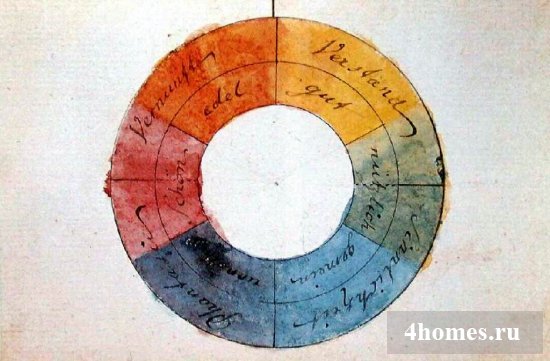
The main, yellow and blue are the main, and additional - orange, green and purple. Additional shades are obtained by mixing two adjacent clean.

Guete also grouped them according to the "characteristics" of combinations.
The "characteristic" treated pairs opposite each other. These couples in his opinion are the most harmonious. Tray symmetric combinations are also allowed. He believed that each of the colors brought his interest. While the unions of two adjacent major or additional shades were redundantly ordinary or too eccentric.
To the "uncharacteristic", he attributed nearby colors, believing that they create a disadvantageous impression. And in no matter how much the shade would be obtained, he invariably adorded the word-console word "went."
Color circle of ytten
Johansen Theorist ITten criticized the 6-Spector Circle Goethe and created a 12-private circle of color combinations, now considered by the classics. It is also based on 3 clean colors - red, yellow and blue. Then follow the derivatives obtained by the merger of two adjacent clean. The rest are formed in the same way.
To this day, designers, photographers, hairdressers and makeup artists actively use it.
Color circle Oswald
The color system of Wilhelm Oswald is also popular. It is a continuous spectral circle, also based on 3 colors, but instead of yellow - green, the other two remained unchanged: red and blue. This circle is the basis of the additive color model RGB.
This modern system Color reproduction is used for emitting light sources, such as computer monitor, TV screen, smartphone display and others. White is interpreted as zero color intensity, and black - as the maximum.

By many internet users, this color circle is periodically used - the combination of flowers online, and its code is displayed for each shade, and sometimes its name. White and black as such are not present in it.
Color Combination Schemes on Color Circle
The following methods for determining acceptable color combinations are distinguished:
Monochrome - a combination of different shades of the same color.

Similar - a combination of 2 to 5 shades of three nearby sectors.

Communicative is a combination of the main and opposite color.

Split-complimentary is a combination of the main and pair of the opposite colors.

Triad is a combination of 3-colors equidistant to each other.

Tetrad - two pairs of sectors opposite.

Square - four equidistant sectors.

circle - Combination of Flowers
It is established that the most successful for human vision combination 2-3 colors. However, creative people when creating graphic images, quite often base the image on a larger number of color shades.
Combined and non-combined colors in the interior
Before starting repair, it is necessary to thoughtfully determine the color combination in which this or that room will be issued. It should be borne in mind that by no means each quit in the elected style of the interior. For example, a combination of a saturated brown, burgundy and golden is not suitable for High-Tech style; This is typical for.
In order to simplify the selection, you can use reminders. They may be able to help either push the interesting idea.


As well as examples of some color combinations.

It is known that the colors affect the mood, so when the selection is optimally familiar with the value and associations to them.

When integrating them in the interior, the size of the premises, as well as the quality and intensity of lighting, should be considered. Otherwise, the room can be visually narrowed, and bright colors instead of looking piquant and attractive, may seem on the contrary dull and ordinary.


Each designer, creating an interior design, applies a color circle, a combination of colors defined with it. Taking them as a basis, they develop a concept that takes into account the preferences and the most pronounced traits of the nature of homeowners, dimensions and the degree of illumination of the premises.
Coco Chanel said that the most successful color is the one that suits you most. And it is better to say it is simply impossible, but it is sometimes difficult to carry out this.
In our wardrobe there are always things of different colors, but it is difficult for us to make them well combined with each other. Even if you try to wear things like the same color, you can not achieve color harmony. Each color has different shades. But if you study a little color harmony, then you will learn to easily find suitable shades and properly pick up clothes.

It is important to know science, how to combine colors in clothes and be able to create a harmonious image to show anything in a favorable light. Various shades, interacting with each other, turn into various color combinations. Using the right combinations of colors, you can improve the interior, clothing and many other things.
There is a color theory that will help any compile color combination of colors. With what colors to combine in clothes, you can pick up clothes with ease. This skill is quite important, especially if you make purchases on the Internet, because in them you can not stand in front of the mirror and see how one or that thing is sitting on you. To learn how to pick up colors, you will need to take the color circle and carefully examine it.

How to use a color circle
The combination of colors occurs according to certain rules. Artist I. Itutin created certain colors schemes that most of all come to each other. He placed all the colors in the circle in such a manner so that they are separated from the degree of primaryness and interact with each other.
This circle was created in order for novice artists to work easier with flowers. They were able to find out which shades are combined with each other. Such a color circle helps all people who are engaged in creativity, including clothing designers.

In the closed space of this circle, colors are placed - from basic, to secondary and tertiary. Many shades are formed from basic colors - red, blue, yellow. The more colors are mixed, the more shades are obtained. To accommodate the entire spectrum of existing colors, the sphere with an even large number of shades is placed inside the circle.

Creation of color harmony
If we consider the basis of the color composition, you can see how colors are combined with each other. There are many different combinations that are combined into certain schemes that are not repeated among themselves. To build a particular scheme, several tones are taken, which are mixed with each other. With the help of the circle of itten, you can build harmonious combinations. Consider how this can be done.

You can build a color harmony from several colors in the amount of two, four, six. In two-color color harmony, the same and contrasting shades are used. For beginners, it is important to learn to combine different shades of the same color.

It is enough to take one main color and try to pick up the shade of the same color to it. Clothing of the same shades will give nobility. In order not to make a mistake, it is better to choose the shades removed from each other. Your clothes should not merge, otherwise it will look unattractive.
No less attractive, a combination of different colors that contrast each other in a color circle will be considered. Take the orange and connect it with blue, it will turn out beautiful color contrast. Red on the background of green will also look attractive. But in order for the color of the clothes did not shout, did not twist too much, it is best to take some color as a basis and add a little contrasting to it.

Creating similar suitable three-color combinations, you need to take the colors that are located near the color circle. In the harmony of color it is called an analog triad. In three-color harmony, the adjacent colors and similar kolas are usually taken, which are harmonized with each other. It is also important to choose those colors that will not merge with each other.
To create a classic three-color scheme - a triad you can use an equifiable, equilateral triangle. You must highlight three equal colors from the circle, which are harmonized with each other to create a triangular geometric shape.

It is important to highlight the main color, and the other two must be present in a small amount and complement the main one. From the primary colors you can take red, blue, yellow, from the secondary - purple, green, orange. You can combine colors along the line using both adjacent colors and additional shades.

Try to enter in the circle of itten the geometric shape - a rectangle and a square. In a square scheme, take 2 or three similar colors. If you take different, then you risks look ridiculous. For example, you may have a four-color consonance from such colors: purple, blue with green tint, yellow and red with orange tint.


In a rectangular scheme, two pairs are selected that contrast each other. And here you open space for your imagination. However, you should be careful, otherwise the colors will be twisted, and your image will be too screaming and ridiculous. This will not happen if you pick up three shades to one basic color. You can even insert an equilateral hexagon in the circle, then the harmony of six colors will turn out.
All these schemes, as well as a table of combined colors help you do you. right choice In clothes.


Proper combination of colors in clothes
It is better to take a dark as the main color. To dark basic things, such as costumes, jackets, trousers, skirts are selected bright.
Should not allow clothes reminded "outfit fabulous hero Parsley. " And this will not happen if the color of all clothes will be harmonized. If you want to get a contrast combination, then you should not choose equal proportions of colors. In the color of the blocking always choose one bright color, while others are not too. Combine bright colors with pale, inexpressive and your image will not look ridiculous.


Screaming tones in clothing balancing neutral. However, not all neutral colors can be used. If you take black, then you should not pick up bright colors, as it is in itself rich.
When you pick up the clothes of neutral shades, you can safely choose 3 things in samely color, but not more. To make an image, you should choose one bright color and somewhat neutral.
Beige and gray tones will benefit the appearance on the background of pastel. Such a combination always creates softness in the image.


Sometimes it is difficult to determine which colors are combined with each other. In this case, you can use the tips of the stylists, how to choose the right color. There are win-win options using which you can always look great.
Our attractive appearance It will depend on how correctly we combine colors in clothes, watch photos not to make a mistake. Red always looks bright and makes an image amazing, but it is necessary to carefully pick up clothes.
No other color should be knocked out of the red, so choose neutral tones - beige, gray, dairy, purely white. Pink and purple will also look beautiful on the background of red. Red clothing is typically combined with brown, chocolate tint, blue.


When you choose a yellow outfit, then pick something bright to it, something that creates tenderness. If this is a ocher color or orange, then he will also look attractively on the background of yellow. Pastel shades with yellow - successful combinationsBut only if the first are not so bright, but a little muffled. Want to create a contrast with yellow, take a red or black tone for this, and maybe turquoise.
If you wear a cold green shade thing, then pick it up to it that in light gray color, as well as blue, cream. Green color In the warm version will be harmonized with blue, brown or beige. Peach, apricot, celestial shades with warm green will create a tender image.


When choosing pink colour It is necessary to take into account the cold it or warm. To the warm shade, pick something mint, light green, gentle-lilac, amethyst or even blue jeans. If pink cooling, then other tones should be blond and neutral. Not bad will look at the shades of mint and jeans.
TO brown You can choose a huge set of other shades, but most of all are suitable green, blue yellow and reddish tones.


Burgundy color can be saturated with olive, bright gray whether dark green. The red color is also suitable only if it is complex or has a berry tone - blueberries or blackberries.
Turquoise colors will decorate if they are paired light yellow. Orange or simple white. Fuchsia's shade is also advantageous on turquoise.


Coral shades are successfully followed by beige, bodily gray. Tones of roses and lilac can also be added to coral. Try to choose something dark brown, light yellow, dark blue or khaki color.
The color circle and the photo of the combined colors will undoubtedly help you in the selection of tones in clothes, but you can do it at an intuitive level, based on your taste. If you know how to pick up successful combinations, then you can always look great for any circumstances.


Consider style
It's a little about how to combine color in clothes, you need to take into account the style and the case to look harmoniously.
Business lady should not use a lot of diverse shades in clothing. It is always necessary to adhere to the rules that shades may be no more than three. Although of course it is allowed to use more, but they should be close to each other. Standard colors business style is white, black dark blue, gray and beige. But if you choose different shades of these colors, it can also look great.


IN classic style The number of colors used and shades can be increased, but only until that time, while it looks elegant. Therefore, catchy tones should not be applied, unless this is not red, which, by the way, is also considered to be classic. Therefore, choose dark shades. White, beige, gray, creamy, beige, gray, cream are suitable for this style.
For the selection of evening clothes, there are many color variations. The main thing, it must create a bright noticeable image that will allocate from the crowd. The right color solutions will help to highlight the advantages of the figure. Black evening outfits are a classic, but any dark shades here are also suitable.


If you want to look bright and creatively and emphasize your creative nature, pick bright tones that look nontrivially. Here you see a wide choice. You can choose any bold combination, but still you should try not to overdo and do not make an image too moving. Six tones will be enough, boldly add black to other tones, it will look attractive.

Casual things should be bright and saturated colors. Dresses for every day should be functional and elegant. Brown, red, gray, blue, terracotta will perform this task and create a pleasant image. You can choose a light tone, but you should not take too light, let it be with a slightly gray tint.


For romantic style Pastel shades and their combinations are selected. And beware of using too dark tones, otherwise you risks look gloomily. Light colors can be supplemented with any bright, which correspond to the common palette. Prints will give femininity, and will allocate romanticism.
Common Color Gamma for sport style includes dark variants of gray or blue shades. However B. lately Stylists fit bright saturated shades into this style. Glowing neon colors have become very popular in sportswear, so you can safely choose them.